Because the new desktop app is capable of displaying just so much information in a single page, I knew we would need some way to filter it down. The very earliest versions of the Student View in the new app had an Enrollment filter that allowed you to select the enrollments you'd be seeing data for, but it didn't provide any way to make that selection permanent. You had to do it and redo it on a student-by-student basis. It defaulted to showing only data for the most recent enrollment, and then provided a single button to show data for all enrollments, but it was pretty clunky. And many users never even noticed it was there in the first place.
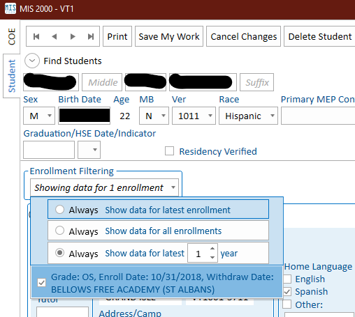
So the latest version of the new app has a much improved, and hopefully more visible, enrollment filter. Here's what it looks like:

So now you can filter the current student's data to the latest enrollment, all enrollments, or enrollments for the latest N years, and you get to pick how big N is! You can also click the radio button to the left to set this as the new default that will apply to all students in the future. Hopefully this will meet everyone's needs for seeing the data they need to see without being overwhelmed by what they don't need.